Quality teams frequently operate on perception. “We’ve had a lot of defects this month.” “Most of the problems come from the payment system integration.” “That module gives us more trouble than the others.” These are plausible statements — and, most of the time, grounded in selective memory rather than data.
The question that typically exposes this fragility is a simple one: how many, exactly? And that’s where most teams hesitate.
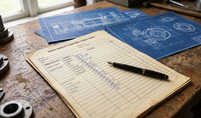
The Check Sheet is the simplest of the Seven Basic Quality Tools — and also the most underestimated. It doesn’t analyze, prioritize, or explain anything on its own. Its function is more modest, and for that very reason, more fundamental: it transforms scattered observation into structured data. Without it, none of the statistical tools that follow — Pareto, histogram, control chart — have reliable raw material to work with.
What a Check Sheet Is
A Check Sheet is a structured form for the systematic recording of occurrences, filled out at the time and place where the event happens.
The defining characteristic isn’t the format — it can be a spreadsheet, a digital form, or literally a sheet of paper with tally marks — but the method: data is captured at the source, while the event is happening or has just occurred, rather than being reconstructed from memory days or weeks later.
That difference may seem trivial, but it isn’t. Data reconstructed from memory carries availability bias: we more easily recall the most recent, most dramatic, or most personally bothersome problems — not necessarily the most frequent or most relevant ones. The Check Sheet eliminates that distortion by anchoring the record to the exact moment of occurrence.
The tool’s value, therefore, lies entirely in the rigor of collection — not in the sophistication of the instrument.
Where It Fits Historically
The Check Sheet occupies a transitional position in the evolution of quality as described by Garvin. In the Inspection Era, verification happened item by item, in isolation — a product was either within or outside specification, and that finding rarely became aggregated, analyzable data.
It was with the advancement toward Statistical Quality Control — when managers began looking at the process generating defects, not just the defective product in isolation — that systematic data collection became indispensable. Without reliable data series, tools like Shewhart’s control chart simply have nothing to control.
Later, Kaoru Ishikawa consolidated the Check Sheet as one of the seven basic tools — a set deliberately designed to be operable at any level of the organization, without requiring advanced statistical training. This is, perhaps, Ishikawa’s most underappreciated contribution: democratizing statistical control, taking it out of the exclusive domain of engineers and statisticians and placing it in the hands of those closest to the problem.
The Four Main Types
Classification (defect/frequency check sheet)
Records the frequency of different types of defects or causes over a defined period. It is the most common format: a table with categories in the rows, time periods in the columns, and tally marks in the cells.
Example: weekly count of bug types reported in production — validation error, integration failure, UI error.
Location check sheet
Instead of a table, it uses a diagram or schematic of the product to physically mark where the problem occurs. Very common in manufacturing (marking the region of a part where scratches or blemishes appear), but adaptable to any scenario where the location of the defect is relevant information.
Measurement distribution
Records numerical values organized into predefined ranges — for example, API response time distributed across 50ms intervals. This type of sheet already visually anticipates the shape of a histogram, making it the step immediately preceding one.
Cause-and-effect
Crosses suspected causes — typically identified beforehand in an Ishikawa Diagram — against the observed frequency of each. It functions as a bridge between the qualitative hypothesis (“I think the problem is X”) and the quantitative confirmation (“X actually accounts for 60% of cases”).
How to Build One — Step by Step
- Define precisely what will be observed. A specific event, defect, or occurrence — not a vague category like “problems.”
- Define mutually exclusive categories before starting collection. This is the most frequently mishandled step. Overlapping or ambiguous categories produce data that looks quantitative but isn’t reliable.
- Define the collection period and who is responsible. Without this, the sheet becomes a sporadic record, not a data series.
- Standardize the format. Everyone filling out the sheet must use the same classification criteria.
- Record the fact, not the interpretation. This is the most critical point: the Check Sheet records what happened, not why it happened. Cause analysis comes later, with other tools.
The most common mistake at this stage is mixing collection with diagnosis — someone marks an occurrence while already trying to explain it, and the category chosen reflects an assumption rather than a neutral observation. This undermines the reliability of everything built on top of that data afterward.
Application in Software Engineering and QA
The logic of the Check Sheet translates to the software development context with almost no adaptation:
Defect triage in the STLC. During test execution, tallying defects by module, type, and detection phase produces a foundation that guides prioritization decisions in subsequent cycles — exactly the kind of data that typically remains scattered across bug management tools without ever becoming structured analysis.
Retrospectives and sprint reviews. Counting recurring root causes across multiple sprints — integration failure, business rule error, UI issue — reveals patterns that a retrospective based solely on the team’s memory would rarely capture.
CI/CD pipeline monitoring. Frequency of failure types in builds or automated tests, categorized by pipeline stage, helps identify where the continuous integration process is least stable.
A simple application example — weekly bug count by category:
| Category | Week 1 | Week 2 | Week 3 | Total |
|---|---|---|---|---|
| Validation error | III | IIII | II | 9 |
| Integration failure | IIII | IIII | IIIII | 13 |
| UI error | III | II | II | 6 |
| Business rule error | II | II | 4 |
Even in this basic format, the pattern already begins to emerge: integration failures concentrate the highest volume of occurrences — a clear signal pointing to where the next stage of analysis should be directed.
The Link to the Pareto Chart
The Check Sheet provides the raw material; it doesn’t tell you on its own where to focus effort. It is the Pareto Chart that organizes this data by relevance, applying the principle that a minority of causes typically accounts for the majority of occurrences.
In the table above, for example, a Pareto would quickly reveal that integration failures and validation errors together already account for the largest share of recorded defects — information that guides where to invest correction effort first.
Conclusion
The Check Sheet isn’t an impressive tool. It lacks the visual sophistication of a Pareto diagram and the statistical rigor of a control chart. But it is precisely that simplicity that makes it indispensable: it is the point at which a quality culture decides whether it will operate on data or on impression.
Teams that master this basic tool — and apply it with discipline, without mixing collection with diagnosis — build the foundation on which all subsequent statistical tools depend. Understanding why this tool exists, not just how to fill it out, is what separates a superficial quality practice from one that is genuinely data-driven.